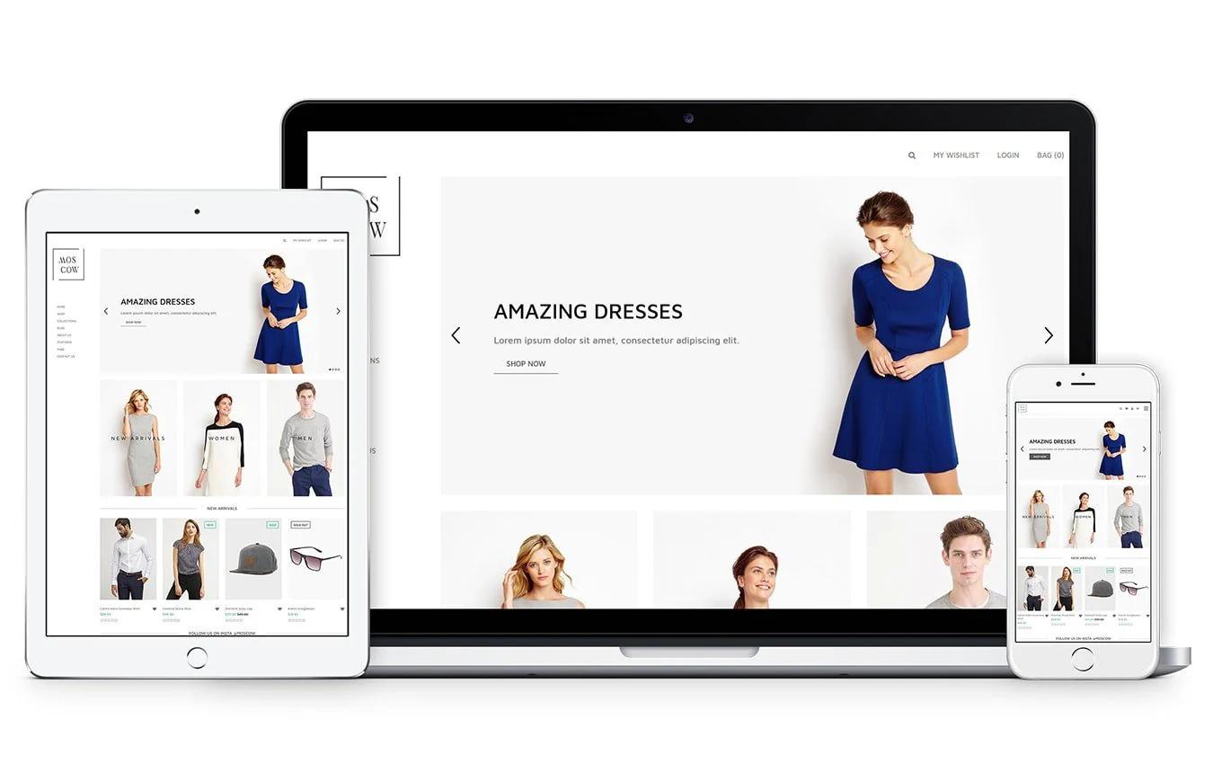
Your store's theme isn't just about looking pretty. It shapes how customers experience your brand, influences whether they trust you enough to buy, and determines if they can actually find what they're looking for. When you study Shopify product page examples from successful stores, you'll notice that the best ones balance aesthetics with function, making the buying process feel effortless rather than complicated. This article walks you through how to choose a Shopify theme that protects your conversion rates while reflecting your brand's personality, covering everything from mobile responsiveness to checkout flow optimization.
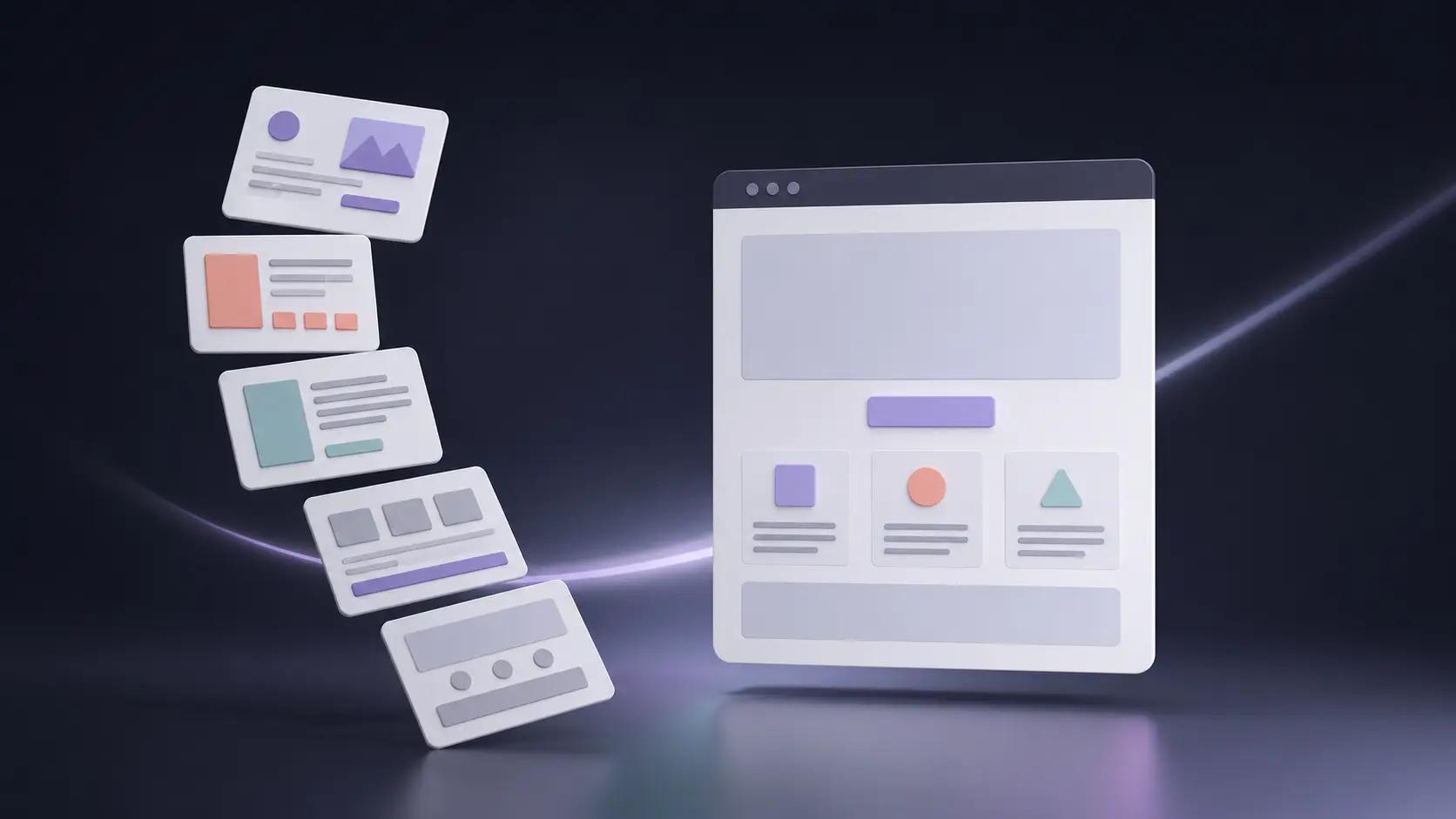
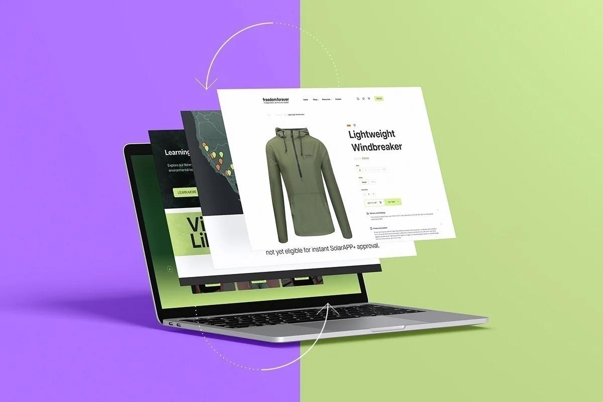
PagePilot's AI page builder takes the guesswork out of theme selection by analyzing what works for stores like yours and helping you build product pages and layouts that convert. Instead of spending weeks tweaking templates and wondering if your design choices are costing you sales, you get data-informed recommendations that align with your specific products and audience.
Summary
- Choosing a theme too early locks you into a structure before you understand what your store actually needs to convert. You're making foundational decisions about layout, navigation, and content hierarchy based on how a demo looks, rather than on how your specific product needs to be positioned or on the objections your buyers will raise.
- Speed has a greater impact on conversion performance than visual polish. Google's Core Web Vitals data from 2024 shows that 53% of mobile users abandon sites that take longer than three seconds to load. As page load time increases from one to three seconds, the probability of a bounce increases by 32%.
- Mobile traffic dominates ecommerce but many themes remain designed desktop-first. Meetanshi's merchant survey found that mobile responsiveness is a priority for 85% of merchants, yet mobile conversion rates consistently lag behind desktop due to usability issues embedded in theme design.
- Testing velocity drives conversion improvements far more than perfect design. Research from Invesp shows that companies that test consistently see an average 223% increase in conversion rate compared to those that don't. But this advantage only materializes when testing is frictionless.
- Popular themes succeed in demos because they showcase idealized scenarios with strong product photography, headlines that speak to specific pain points, and copy that addresses real objections. Baymard Institute's 2024 usability research found that 61% of users abandon product pages not because of poor design, but because the page failed to communicate clear value within the first eight seconds of arrival.
PagePilot's AI page builder generates product pages optimized for your specific offer and customer objections, then deploys them across 30+ supported themes that prioritize speed and conversion architecture, letting you iterate and republish changes in under 60 seconds without touching code.
The Real Problem With Choosing a Shopify Theme
Choosing a theme too early locks you into a structure before you understand what your store actually needs to convert. You're making foundational decisions about layout, navigation, and content hierarchy based on how a demo looks, rather than on how your specific product needs to be positioned or on the objections your buyers will raise. The theme becomes a constraint disguised as progress.
The Paradox of Choice
Shopify's theme store offers over 800 options, ranging from free to paid templates. That volume doesn't create opportunity. It creates paralysis. You click through dozens of demos, each showcasing flawless product photography, perfectly crafted headlines, and copy that speaks directly to an imagined customer.
Your product rarely fits that mold on day one. You're comparing your rough draft to someone else's highlight reel, then choosing a framework based on aspiration rather than reality.
The Illusion of Legitimacy
The decision feels significant because it looks significant. You pick a sleek layout, adjust the color palette to match your brand guidelines, upload a logo, and suddenly the store feels legitimate. There's a psychological weight to that moment. It signals you're open for business. But that confidence is deceptive.
The theme gives you the appearance of completion while quietly masking the structural issues that will prevent sales: unclear value propositions, generic product angles, weak trust signals, and copy that doesn't address real buyer hesitation.
The False Sense of Momentum
When the store looks polished, you assume the hard work is done. You've invested hours tweaking layouts, adjusting spacing, and selecting fonts. The visual coherence feels like validation. But a theme optimized for a fashion brand selling $200 dresses operates under completely different conversion logic than one built for a $30 gadget with impulse-buy potential.
The Traffic Trap
The layout that works for high-consideration purchases with long research cycles won't serve a product that needs to convert cold traffic in under 60 seconds. The trap deepens when sales don't follow. You assume the issue is traffic volume or product-market fit. You pour energy into Facebook ads or influencer outreach, convinced that more eyeballs will solve the problem.
Predefined Product Stories
The theme already decided how your product story gets told. It determines where trust elements appear, how much space your headline gets, and whether urgency or social proof takes priority. Those decisions were made by a designer building for a broad audience, not for your:
- Specific offer
- Price point
- Customer objection pattern
The Cost of Rebuilding
Switching themes later reveals the true cost. Every customization you made, every app integration you configured, and every product page you optimized under the old structure must be rebuilt.
What felt like a branding win six weeks ago now creates friction. You're not just changing aesthetics. You're unwinding hours of work because the foundation didn't match the building you needed to construct.
When Design Becomes a Distraction
Most themes prioritize visual appeal over conversion architecture. Sellers gravitate toward layouts with bold hero images, dynamic sliders, and creative navigation because those elements feel premium. They signal professionalism. But conversion research from Baymard Institute (2024) shows that excessive design elements, particularly carousels and multi-step navigation, increase bounce rates by up to 40% on product pages.
The Warm-Traffic Bias
The creative choices that make a theme demo impressive often lead to decision paralysis for visitors who arrive with no context about your brand. You're building for cold traffic, but the theme assumes warm visitors. It's structured for people who already trust you, who came to browse your catalog, and who are willing to explore multiple pages to understand your value. That's not how most dropshipping or direct-to-consumer traffic behaves.
Visitors from paid ads or social media arrive skeptical, impatient, and ready to leave within seconds if the page doesn't immediately answer their core question: why should I care about this product right now?
Designed for Loyalty, Not Conversion
The theme's structure fights against that reality. It spreads trust signals across multiple sections. It buries the call-to-action below the fold. It assumes people will scroll through lifestyle imagery and brand storytelling before making a decision. That works for established brands with loyal audiences. It fails for stores trying to convert strangers who need convincing in the first three seconds.
The Compatibility Trap
Themes also dictate what's technically possible without custom development. You choose a layout that looks clean, then discover it doesn't support the review app you want to use. Or the urgency timer you need for limited-time offers. Or the upsell logic that could increase average order value by 30%.
You patch the gaps with apps, but each integration slows your site, creates potential conflicts, and adds another monthly subscription cost.
The Hidden Cost of Speed
Speed becomes a hidden casualty. According to Google's Core Web Vitals data (2024), 53% of mobile users abandon sites that take longer than three seconds to load. Themes built for visual impact often sacrifice performance.
- They load high-resolution images by default.
- They include animation libraries you'll never use.
- They add JavaScript to enable features that don't support your conversion goals.
Content vs. Container
The real problem isn't that themes are poorly designed. Most are well-crafted for generic use cases. The problem is that choosing too early forces you to adapt your product, messaging, and conversion strategy to fit someone else's assumptions about what an online store should look like. You're building backward, starting with the container instead of the content.
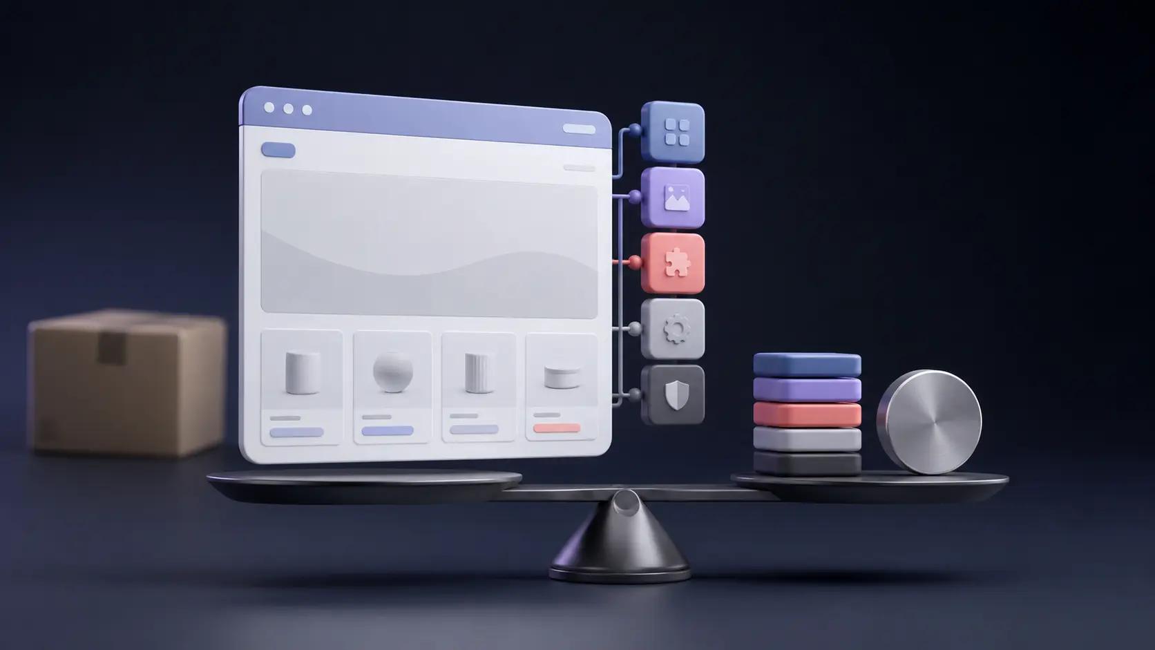
Tools like PagePilot's AI page builder flip that sequence. Instead of selecting a theme and hoping your product fits, you start with what actually needs to convert: your specific product angle, your target customer's objections, and the psychological triggers of your price point.
The layout gets built around those elements, using conversion patterns proven to work for similar offers, then deployed on themes already optimized for speed and compatibility. You're not customizing a generic template. You're generating a page structure designed for your exact scenario.
Related Reading
- Shopify Product Page Examples
- How to Make Your Shopify Store Look Professional
- How to Increase Conversion Rate Shopify
- Best Size for Shopify Product Images
- eCommerce Product Page Optimization
- Shopify Banner Size
- How to Create Multiple Product Pages in Shopify
- How to Change Favicon on Shopify
- How to Add Size Chart in Shopify
- How to Customize Shopify Checkout Page
Why Most Shopify Theme Advice Leads You in the Wrong Direction
Conventional theme guidance tells you to choose based on popularity, visual polish, or niche alignment. This advice sounds practical, but quietly assumes your product already has:
- Refined messaging
- Proven demand
- Clear positioning
When those elements don't exist yet, the theme becomes a beautiful container for an unclear offer, and no amount of design sophistication can fix that gap.
The Credibility Trap
The real damage happens when visual credibility masks fundamental problems. Your store looks legitimate, so you assume the foundation is solid. You start:
- Spending on ads
- Testing audiences
- Cycling through creatives
Traffic arrives, people browse, maybe they add items to the cart. But purchases don't follow. The pattern repeats until you're stuck in a loop of tactical adjustments while the core issue, buried in your theme's structure, remains untouched.
Why Best-Selling Themes Create False Confidence
Popular themes succeed in demos because they showcase idealized scenarios. Strong product photography. Headlines that speak to specific pain points. Copy that addresses real objections. Social proof is positioned exactly where doubt peaks.
When you install that same theme with generic product images, vague value propositions, and copy that could describe a dozen competitors, the layout doesn't adapt. It expects clarity you haven't built yet.
The Relevance Gap
I've watched sellers pour weeks into customizing premium themes, adjusting every visual detail, convinced that polish equals performance. The store looks professional. Friends say it's credible. But visitors don't convert because the page never answers their core question: why does this product matter to me, right now, more than the fifteen similar options I could find in the next three minutes?
That's the gap most theme advice ignores. It treats design as the variable when messaging is the constraint.
Design vs. Messaging
A modern layout can't compensate for unclear positioning. Clean typography doesn't fix weak copy. Smooth animations don't address buyer hesitation. The theme makes those problems look intentional, which is worse than making them look broken, because it stops you from searching for the real issue.
When Aesthetic Alignment Backfires
Matching your niche's aesthetic feels smart. If you're selling minimalist home goods, you choose a clean, spacious theme. If you're in fitness, you pick something bold and energetic. The logic seems sound: visual consistency builds brand trust. But this approach assumes your target customer responds to category conventions, and that assumption often fails.
The Eight-Second Clarity Rule
According to Baymard Institute's 2024 usability research, 61% of users abandon product pages not because of poor design, but because the page failed to communicate clear value within the first eight seconds of arrival.
Aesthetic alignment doesn't solve for speed of comprehension. It optimizes for brand coherence, which matters far less to cold traffic than immediate clarity about what the product does and why it's worth considering.
The Friction of Familiarity
You're designing for an audience that doesn't know you yet, but the theme assumes familiarity. It spreads key information across multiple sections, expecting visitors to scroll and explore. It prioritizes visual storytelling over directness. That works for brands with existing awareness. For stores trying to convert strangers from paid ads, it creates friction at the exact moment you need momentum.
The Hidden Cost of Generic Structure
Most themes are built for flexibility, meaning they're optimized for no specific purpose. They include dozens of sections you'll never use, layout options that don't align with your product's conversion logic, and design elements that slow load times without advancing your goals. You inherit technical and strategic debt before understanding what your store actually needs.
Discovery by Constraint
Sellers often discover these constraints too late. You've spent hours configuring the theme, integrating apps, and customizing product pages. Then you realize:
- The layout doesn't support the urgency timer you need for limited offers.
- Or the review placement doesn't align with where buyer doubt peaks.
- Or the mobile experience, which looked fine in preview, actually buries your call-to-action after three swipes.
The Sunk Cost Trap
Rebuilding at that point feels impossible. You've invested too much to start over. So you patch the gaps with workarounds, additional apps, and custom code you don't fully understand. Each fix adds complexity, slows your site, and increases the likelihood of issues during an update. What started as a design decision becomes a technical constraint that limits how fast you can test, iterate, and scale.
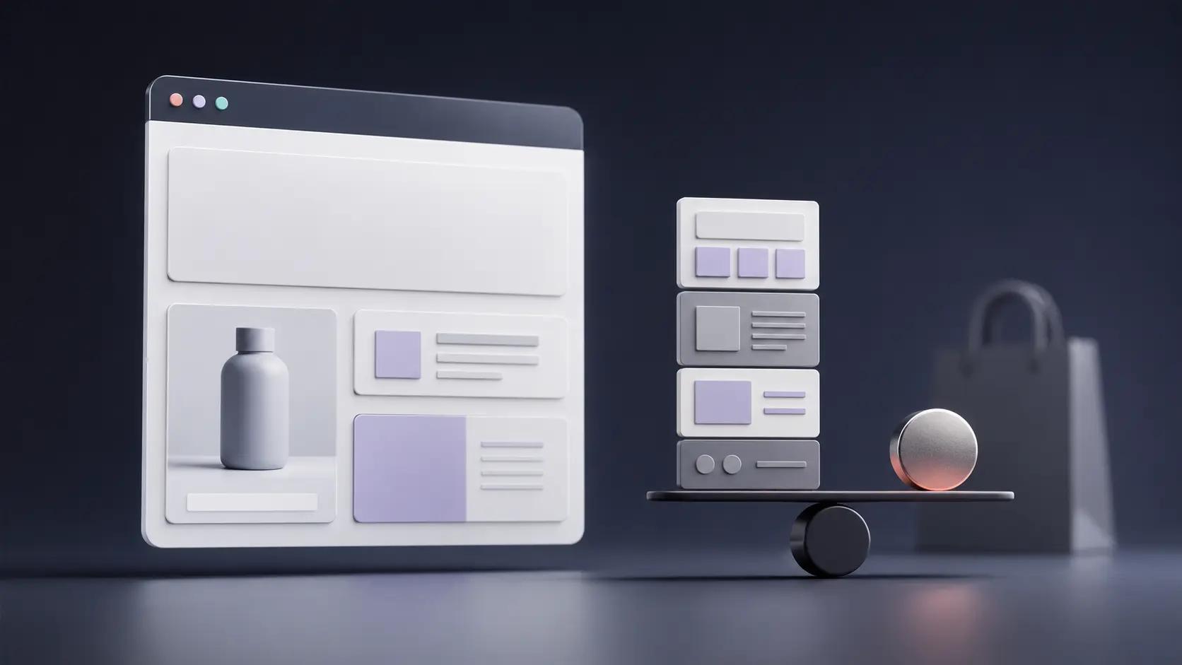
Conversion-First Sequencing
Platforms like PagePilot's AI page builder reverse that sequence. Instead of selecting a theme and hoping your product fits, you start with what needs to convert: your specific offer, your customer's objections, and the psychological triggers of your price point.
The layout is generated around those elements, using structures proven in similar scenarios, and then deployed to themes already optimized for speed and compatibility across 30+ supported options. You're not customizing a generic template. You're building a page designed for your exact conversion context.
Why Polished Stores Still Fail
Visual professionalism creates seller confidence, not buyer confidence. You see a store that looks credible and assume visitors will trust it. But trust doesn't come from clean layouts or modern fonts. It comes from clarity about value, specificity about benefits, and proof that others made the same decision successfully.
The Camouflage of Polish
A polished theme can actually make weak positioning harder to diagnose. Everything looks intentional. The spacing feels right. The color palette is cohesive. Friends and family say it looks great. When conversions don't follow, you assume the problem is traffic quality, ad targeting, or product selection.
You keep cycling through external variables while the real issue, the unclear value proposition embedded in your page structure, never gets addressed.
One seller I spoke with described spending two months testing different ad creatives and audiences for a shapewear product. The store looked professional. Add-to-carts happened. Checkouts initiated. But purchases stayed near zero. The theme wasn't the problem in isolation.
The Mask of Vague Positioning
The problem was that the theme's structure never required them to answer the hard questions: what specific pain this solves, who experiences it most acutely, and why this solution is better than alternatives they already know about. The layout allowed vague positioning to look acceptable, so the fundamental work never happened.
That's the real cost of choosing a theme too early. It lets you feel productive while avoiding the hard strategic work that actually drives conversions. You're building a container before understanding what needs to go inside it, and that misalignment quietly sabotages every optimization effort that follows.
What Actually Matters When Choosing a Shopify Theme
Once you move past aesthetics, choosing a Shopify theme becomes less about branding and more about outcomes. Specifically, how quickly shoppers can understand your offer and decide to buy. Research consistently shows that four factors matter far more than visual polish.
Clear Information Hierarchy Above the Fold
Shoppers make decisions fast. According to recent usability data, 53% of mobile users will abandon a site if it takes longer than three seconds to load, and the decision to stay or leave often happens even faster based on what they see immediately.
Users decide whether to stay within the first 10 to 20 seconds, relying heavily on what appears above the fold. If the product, value proposition, and next action aren't immediately clear, visitors don't scroll. They leave.
The Hierarchy of Clarity
A Shopify theme should make it easy to prioritize what the product is, who it's for, why it's different, and what to do next. Themes that force decorative elements or oversized visuals above key information slow buyer understanding and hurt conversion clarity. The layout should answer the visitor's core question ("Why should I care about this?") before they have to work for it.
The Information Mismatch
Many sellers discover this gap only after traffic begins to flow. The store looks cohesive. Images are high quality. But visitors bounce because the page never tells them what matters. They see lifestyle photography and brand storytelling when they need specificity about benefits and proof that the product solves their problem. That mismatch costs sales before you even realize the structure is wrong.
Mobile Readability Before Desktop Aesthetics
Mobile traffic dominates ecommerce, but many themes are still designed for desktop first. According to recent merchant surveys, mobile responsiveness is a priority for 85% of store owners, yet mobile conversion rates consistently lag behind desktop due to usability issues embedded in theme design.
The Mobile Revenue Drain
Poor mobile experiences, including cluttered layouts, hard-to-read text, or awkward navigation, cause abandoned sessions. This means a theme's mobile layout, spacing, and content prioritization matter more than its appearance on large screens. If a theme doesn't read cleanly and logically on a phone, it's actively costing sales.
The Real-Device Stress Test
Test your theme on an actual device, not just in responsive preview mode. Scroll through your product page as if you've never seen it before. Does the headline make sense without context? Can you read body copy without zooming? Is the call-to-action button thumb-friendly and placed where your natural scroll stops? Most themes pass the desktop test but fail these basic mobile usability checks.
Fast Load Times and Minimal Friction
Speed is one of the most measurable conversion drivers. Pages that load in one second convert significantly better than pages that take five seconds or more. Google's research shows that as page load time increases from one to three seconds, the probability of a bounce increases by 32%.
Performance Over Decoration
Themes packed with animations, heavy scripts, and large image files may look impressive, but they slow down the experience before the shopper even engages with the product. A high-performing Shopify theme prioritizes lightweight code, minimal dependencies, and speed over decoration.
The Cost of Technical Debt
You inherit technical debt the moment you install a theme optimized for visual impact instead of performance. Every animation library, every parallax effect, every auto-playing video adds milliseconds that compound into seconds. Those seconds translate directly into lost revenue. One seller tested two identical product pages with different load times and found that the faster version converted 23% better, despite identical copy and images. The only variable was speed.
Flexibility to Change Copy, Images, and Layout Quickly
This is where most themes quietly fail sellers. Early-stage stores rarely get their messaging right on the first attempt. Headlines change. Images need replacing. Trust elements move. Offers evolve. Conversion optimization research shows that continuous testing and iteration are key drivers of performance improvement over time.
Barriers to Execution
A theme that locks you into rigid templates or requires custom development for simple changes slows learning and discourages testing. You spot a better headline angle, but can't implement it without editing code. You want to test urgency messaging above the fold, but the theme's section structure won't allow it. Each barrier between insight and execution costs momentum.
Agile Conversion Architecture
Tools like PagePilot's AI page builder address this constraint by generating page layouts optimized for your specific product and offer, then letting you iterate without touching code. You're not customizing a rigid template. You're working with a structure built for testing, deployed across 30+ supported themes, with a focus on speed and conversion architecture.
Agility as a Growth Tool
When you need to change your value proposition or reposition trust elements, you adjust and republish in minutes, not days. The best Shopify theme isn't the one that looks the best. It's the one that lets you change your mind fast. When a theme supports speed, clarity, and iteration, it becomes a learning tool. When it prioritizes appearance over flexibility, it becomes a constraint.
The Commitment Trap
Most sellers realize this only after they've committed. They've spent weeks customizing a theme that looked perfect in the demo, only to discover that every meaningful change requires workarounds, additional apps, or developer help. By then, switching feels impossible. The sunk cost keeps them locked into a structure that hinders their growth rather than enabling it.
The Hidden Cost of Locking Yourself Into a Theme Too Early
Once you accept that speed, clarity, and flexibility matter more than aesthetics, an uncomfortable reality shows up: most Shopify themes quietly work against all three, especially when you commit to them too early.
Hard-Coded Assumptions
The highest cost isn't obvious at the start. Themes don't just control how your store looks. They hard-code assumptions about how products should be sold. Where headlines go. How images are displayed. How much space copy get? What sits above or below the fold? Those decisions are baked into templates long before you know what actually resonates with buyers.
At first, this doesn't feel like a problem. But the moment you try to improve performance, friction appears.
Reworking Product Pages Takes Far More Time Than Sellers Expect
Changing a headline might be easy. Changing the structure (moving social proof higher, testing a different image sequence, reframing the offer) often isn't. What should be a quick test becomes layout conflicts, formatting issues, or hours spent in the theme editor trying to force a layout it wasn't designed for.
The Friction of Adaptation
Testing new angles becomes even harder. A different customer segment might need a different narrative. A new price point might require a new emphasis. But instead of quickly spinning up a variant, sellers find themselves rebuilding pages from scratch or duplicating templates that still carry the same structural limitations.
This is where behavior changes. Sellers don't stop testing because they run out of ideas. They stop testing because it feels like too much work. Each iteration carries a hidden tax: time, effort, and frustration. Ideas that could have been explored in a day get postponed or abandoned entirely.
Over time, this leads to the most expensive mistake of all: mistaking slow iteration for lack of demand. Products are written off not because customers didn't want them, but because the store couldn't adapt quickly enough to determine what would have worked.
When Themes Dictate Your Testing Velocity
According to Invesp (2024), companies that test consistently see an average 223% increase in conversion rate compared to those that don't. But that advantage only materializes when testing is frictionless. When each experiment requires rebuilding page structure or fighting theme constraints, the testing cadence collapses.
The Price of Opportunity Cost
One seller described spending three days trying to add an urgency timer above the product title because the theme's section structure wouldn't allow it without custom code. Three days for a single element that should have taken minutes. The opportunity cost wasn't just the lost time. It was every other test that didn't happen because the effort felt too steep.
By the time sellers realize the theme is the bottleneck, they've already invested too much time into it. Switching feels even more costly than staying stuck.
Insight at the Speed of Execution
Platforms like PagePilot's AI page builder address this by generating layouts optimized for your specific product and offer, and then letting you iterate without touching code or dealing with rigid templates. You're working with a structure built for testing, deployed across 30+ supported themes, with a focus on speed and conversion architecture.
When you need to test a new value proposition or reposition trust elements, you adjust and republish in under 60 seconds, not days. The tool removes the technical barrier between insight and execution.
The Learning Penalty Compounds
That's the hidden cost of locking yourself into a theme too early: it doesn't just slow your site down. It slows your learning. Every week spent wrestling with layout constraints is a week you're not discovering what messaging works, which objections matter most, or how different customer segments respond to your positioning. The theme becomes a filter that limits what questions you can even ask.
The Silent Budget Burn
Sellers often realize this only after burning through ad budgets on pages that never had a fair chance. The traffic was fine. The product had potential. But the page structure, inherited from a theme selected months earlier based on its appearance in a demo, prevented the kind of rapid iteration that turns mediocre conversion rates into strong ones.
The worst part? This failure mode is invisible until it's too late. The store looks professional. Friends say it's credible. But underneath, the foundation fights every attempt to learn faster.
Related Reading
- Shopify Variants vs Options
- Shopify Websites Examples
- Best Shopify Themes For Conversion
- How To Add Frequently Bought Together On Shopify
- Shopify Variants Vs Options
- How To Add Size Chart In Shopify
- Product Recommendations Shopify
- How To Change Favicon On Shopify
- Shopify Order Confirmation Page
- How To Choose A Shopify Theme
- How To Customize Shopify Checkout Page
A Smarter Way to Think About Shopify Themes
If locking yourself into a theme too early slows learning, the logical next step is to rethink the role a theme should play. Instead of treating it as the foundation of your store, it helps to see a Shopify theme for what it actually is: a tool for execution, not a decision-maker.
The Design-Execution Inversion
Themes are meant to support how you sell, not dictate it. But most sellers reverse this relationship. They adapt their products, messaging, and offers to fit the theme they chose, rather than using tools that adapt to what they learn from the market. When that happens, execution bends to design constraints rather than buyer behavior.
This matters most in the early stages. Early-stage sellers don't need a perfect design. They don't need brand-level polish or pixel-perfect layouts. What they need is speed: the ability to test products, try different messaging, experiment with pricing, and swap visuals quickly based on real feedback.
Testing Velocity Matters More Than Visual Perfection
Research consistently shows that iteration velocity is a major advantage in ecommerce. The faster a seller can test and adjust, the faster they uncover what actually drives conversions. A theme that prioritizes aesthetics over flexibility slows the process, even if the store looks "finished."
Design for the Distracted Shopper
According to recent industry data, mobile commerce accounts for 71% of all ecommerce traffic, underscoring the critical need for themes that prioritize cellular users over desktop aesthetics. That statistic matters less for device optimization and more for what it reveals about buyer behavior: most purchase decisions happen in moments of:
- Distraction
- Impatience
- Limited attention
Shoppers aren't browsing leisurely on large screens. They're scrolling on phones, making snap judgments, ready to bounce if clarity doesn't arrive within seconds.
Speed Over Polish
The environment punishes sellers who spend weeks perfecting a layout but never test whether their headline actually resonates. It rewards sellers who can launch a page in minutes, gather real feedback, and adjust before the day ends. Speed of learning beats depth of polish when you're still figuring out what works.
Design as Evolving Infrastructure
A smarter approach is to treat themes as temporary infrastructure. Choose something simple, lightweight, and unobtrusive, something that stays out of the way while you learn. As patterns emerge and winning products become clear, design decisions become easier and far more informed.
When Design Decisions Should Happen
That leads to the core takeaway most sellers miss: theme choice matters later. Testing speed matters now.
Once you've earned clarity through testing, upgrading or refining your theme becomes a strategic decision. Until then, anything that accelerates learning is more valuable than anything that merely improves appearance.
The Conversion Fallacy
The challenge is that most theme selection advice assumes you already know what converts. It tells you to pick based on niche alignment, feature sets, or visual style, as if those variables matter before you've discovered what messaging works or which customer objections need addressing first. That's backward.
Themes as Scaffolding
Sellers who treat themes as temporary scaffolding rather than permanent architecture maintain flexibility when it matters most. They're not locked into section structures that fight their next idea. They're not rebuilding pages from scratch every time they want to test a new angle. They can move fast because the theme was never meant to be the strategy, just the vehicle.
Built for Iteration
Platforms like PagePilot's AI page builder align with this philosophy by generating page layouts optimized for your specific product and offer, then deploying them across 30+ supported themes that prioritize speed and conversion architecture. You're not customizing a rigid template or committing to a theme before you understand what needs to convert. You're building pages designed for testing, with the flexibility to iterate in under 60 seconds when insights surface.
The theme becomes what it should be: infrastructure that supports learning, not a constraint that limits it.
The Real Cost of Premature Commitment
Most sellers realize too late that their theme choice wasn't a design decision. It was a strategic decision that determined how quickly they could learn, how easily they could adapt, and whether their store structure would support growth or hinder it.
The Friction of Premium
The expensive themes, the ones that look premium in demos and promise advanced features, often create the most friction. They assume you already know your positioning. They expect refined messaging, clear customer segmentation, and proven offers.
When those elements don't exist yet, the theme's sophistication becomes a liability. You're managing complexity before you've earned the clarity to use it effectively.
Simplicity Over Sophistication
According to Shopify theme statistics, the Dawn theme is used by over 1 million stores not because it is the most beautiful option, but because it is lightweight, fast, and flexible enough to support different approaches without imposing a rigid structure. Sellers gravitate toward it once they understand that simplicity serves testing better than sophistication serves appearance.
The pattern repeats across successful stores: they start simple, test aggressively, and upgrade strategically once they know what works. They don't begin with the theme that looks best. They begin with the one that moves fastest.
That shift in thinking, from theme as foundation to theme as temporary tool, changes everything about how quickly you can discover what actually converts. But most sellers never make that shift because the advice they follow treats design as the starting point instead of the outcome of learning.
How PagePilot Helps Test Products Before Your Theme Becomes a Bottleneck
Once you accept that testing speed matters more than perfect design, the final question becomes practical: how do you actually test products without your Shopify theme slowing everything down?
This is where execution matters. Instead of spending weeks choosing, customizing, and reworking a theme before you've validated demand, the faster path is to separate product testing from theme decisions entirely. That's exactly where PagePilot fits, as the execution layer after the mindset shift.
Building Pages Around Products, Not Templates
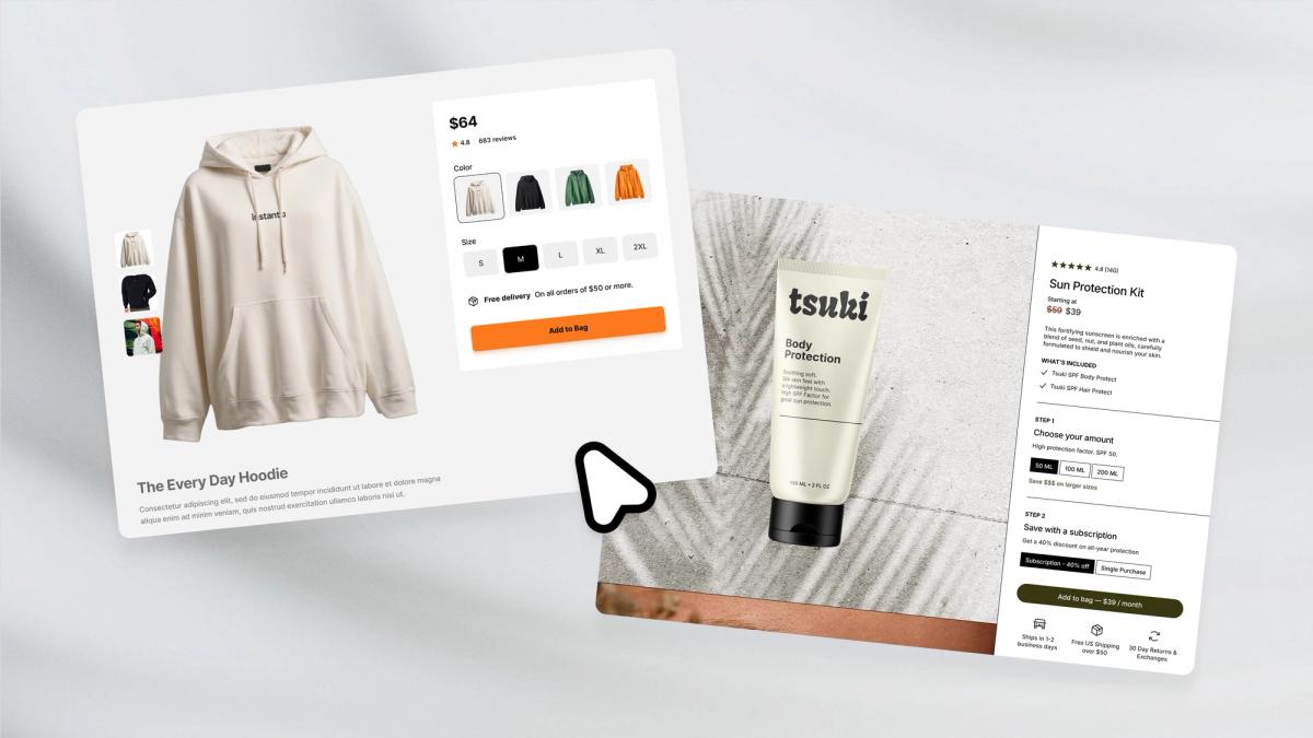
Rather than forcing every experiment to run through your theme's structure, PagePilot lets you generate high-converting product pages directly. You start with a competitor or supplier URL, and the system builds a complete product page using the information found there, but with differentiated copy and structure, not a clone. The goal isn't to look the same. It's to compete more effectively.
Design Without Bottlenecks
The process removes the design bottleneck from testing. You're not customizing sections, adjusting spacing, or fighting layout constraints. The page is built around what needs to convert: your specific product angle, your customer's objections, and the psychological triggers of your price point.
PagePilot also upgrades product visuals using its AI Product Image functionality. This matters because one of the biggest hidden conversion killers is visual sameness. When multiple stores use the same supplier images, shoppers instantly lose trust. Upgraded visuals help you stand out without needing a full redesign or custom photo shoot.
Testing Without Rebuilding
Most importantly, PagePilot removes the theme bottleneck from testing. You can test multiple products without rebuilding layouts, try new angles without restructuring your store, and iterate on copy and visuals without touching theme settings.
Data-First Validation
Your Shopify theme stays in the background, doing what it should: hosting checkout and navigation. Product experimentation happens quickly and independently. That's the real advantage. You're no longer waiting on design decisions to learn what sells. You validate products, messaging, and positioning first, then refine your theme later, grounded in real data.
Velocity Over Friction
According to PagePilot: AI Page Builder, the app maintains a 4.9/5-star rating, reflecting how sellers respond when technical friction is removed from their testing process. The pattern is consistent: when you can launch a product page in under 60 seconds rather than spending days customizing a theme, velocity increases dramatically.
Speed as a Competitive Advantage
The sellers who move fastest don't necessarily have better products. They have better systems for discovering what works. They test more angles, gather feedback faster, and adjust before competitors finish debating font choices.
PagePilot supports compatibility across 30+ Shopify themes, which means you're not locked into a single design framework. You can deploy optimized pages regardless of which theme you're currently using, and switch themes later without losing the conversion architecture you've built.
This matters more than it sounds. When your product pages exist independently of your theme's rigid structure, you maintain flexibility at the exact moment most sellers lose it. You're not rebuilding from scratch every time you want to test a new positioning angle or customer segment.
The question shifts from "which theme should I choose?" to "how fast can I learn what converts?" That shift in priority changes everything about how quickly you can scale past the guesswork phase.
But speed only matters if you're testing the right things, which raises a different question entirely.
Related Reading
• Shopify T-shirt Store Examples
• Best Trust Badges For Shopify
• High Converting Product Pages
• Shopify Electronics Store
• Best One Product Shopify Theme
• Best Shopify Theme For Print On Demand
• Shopify Beauty Stores
• Shopify Contact Us Page Example
• Pagefly Alternatives
Test Products and Ideas Faster with PagePilot
If you want to test products and ideas faster without getting stuck in theme decisions, start a free PagePilot trial today. Generate up to three product pages for free, no credit card required, and validate what converts before locking in a theme.
The real advantage isn't just speed. It's about learning what works before you commit to infrastructure that could undermine your best insights. Most sellers discover their winning angle only after testing three or four different approaches. When your theme makes each iteration feel like rebuilding, you stop testing.
When the tool removes that friction, you keep going until you find what actually converts. That persistence, enabled by the right tools, is what separates stores that scale from stores that stall.