Most landing pages don't fail because of bad traffic. They fail because the page itself doesn't do its job.
You could be running profitable Facebook ads, pulling solid click-through rates on TikTok, or ranking organically—and still watch your conversion rate sit at 1% because your page is unclear, cluttered, or slow. That's wasted spend, and it's a fixable problem.
This guide walks through the best practices for high-converting landing pages: what separates pages that convert at 4–8% from the ones stuck at 0.8%, what structure to follow, how to write copy that actually persuades, and how to get a page like this live without spending a week building it.
Ready to skip the build time? Generate a high-converting product page in minutes with PagePilot.
What Makes a Landing Page Convert Well?
The Core Conversion Formula
A high-converting landing page works by clearly communicating value, removing friction, and guiding users toward a single action. Every element on the page either serves that goal or hurts it.
Here's the framework in plain terms:
All five have to work together. A great offer with weak messaging still loses. Strong design with a buried CTA still loses. Think of it as a chain—any weak link breaks the whole thing.
The Biggest Reason Pages Don't Convert
If you had to trace most poor-performing pages back to a single failure, it's usually one of three things:
- No clear value proposition: The visitor can't tell in three seconds what the product does or who it's for
- Too many distractions: Navigation menus, competing CTAs, and off-topic content pull attention away from the goal
- A weak or passive CTA: "Learn More" and "Submit" don't drive action the way "Get My Free Trial" does
Fix those three, and you'll improve conversion rates before touching anything else.
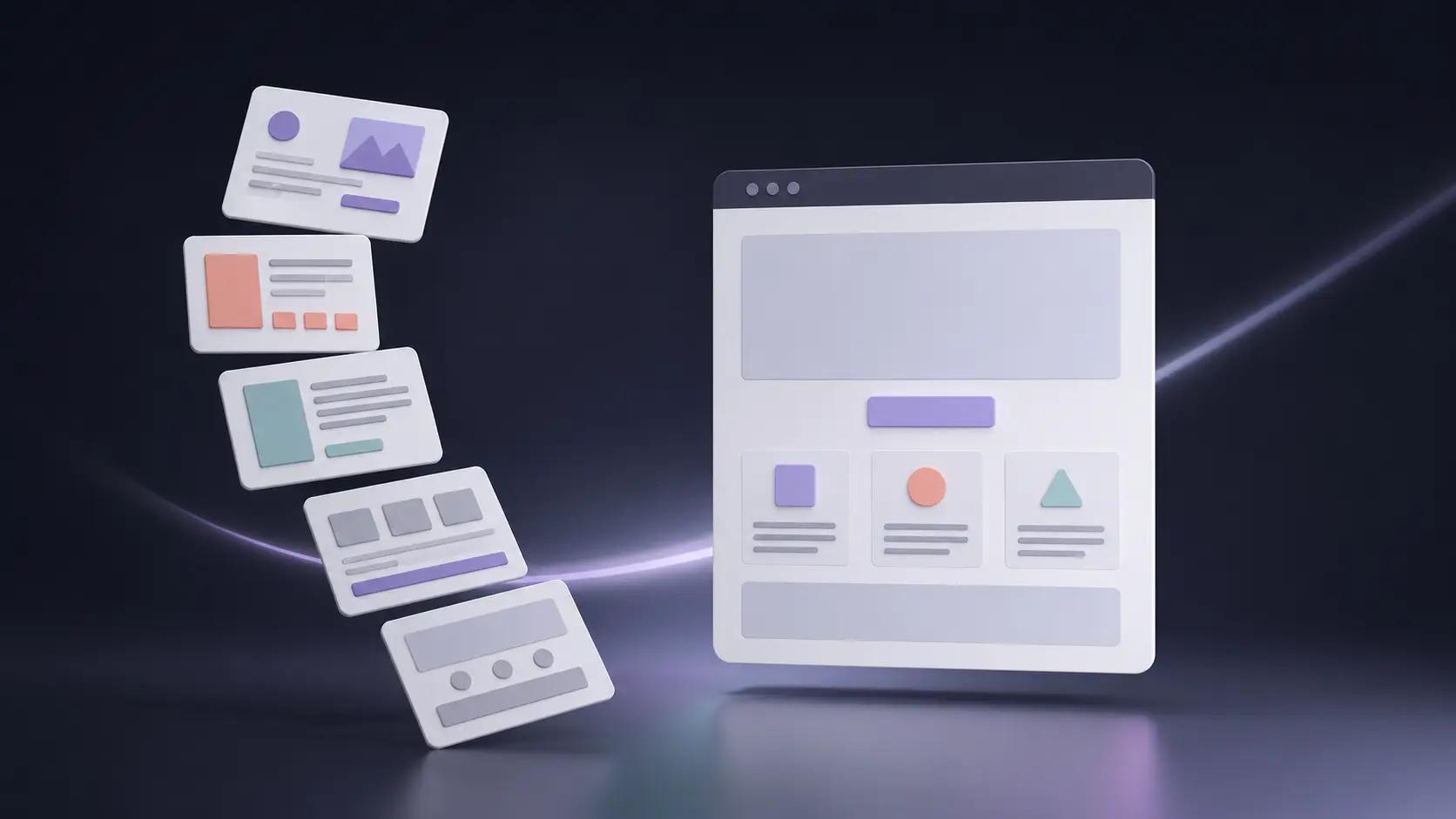
The Ideal High-Converting Landing Page Structure
The highest-converting landing pages follow a predictable structure that guides the user from attention to trust to action. It mirrors how a buyer actually thinks—not how a marketer wants to present information.
Section-by-Section Framework
Hero section: Hook the visitor and communicate the core offer immediately
Problem / pain: Acknowledge the frustration the product solves
Solution / product: Introduce your product as the specific answer
Benefits: Show what changes for the buyer after purchase
Social proof: Reviews, testimonials, UGC, ratings
Offer + guarantee: Restate the deal and remove the last objection
Final CTA: One clear, action-oriented close
Visual Layout: What Each Section Is Doing
Think of it as a three-act structure. The top of the page earns the scroll. The middle builds the case. The bottom asks for the decision.
If you're building this on Shopify, this guide to product page customization covers how to implement each section without touching code.
How to Optimize Your Hero Section for Conversions
The hero is the most important real estate on your page. It's visible before any scrolling happens, and it determines whether the rest of the page gets read at all.
What Your Hero Must Include
Headline Frameworks That Work
The most effective headlines are outcome-focused and specific. Two formats that hold up across categories:
- "Get [specific result] without [common frustration]"—e.g"., "Get a professional product page without touching any code"
- "The easiest way to [achieve a goal]"—e.g., "The easiest way to test ten products before committing to one"
Avoid generic openers. Headlines like "Welcome to our store" or "Premium quality products" tell the visitor nothing and give them no reason to stay.
High-Converting Copywriting Best Practices
Copy That Converts: The Core Principles
High-converting landing page copy focuses on benefits, clarity, and emotional triggers rather than features alone.
The simplest test: read a line of copy and ask "so what?" If the answer isn't obvious, the copy isn't doing its job yet.
Proven Copywriting Frameworks
AIDA (Attention → Interest → Desire → Action): Start with a hook that grabs attention, build interest by connecting with a real problem, create desire by showing the outcome, then prompt action with a clear CTA.
PAS (Problem → Agitate → Solution): Name the problem, make it feel more acute by spelling out the cost of not solving it, then position your product as the answer.
These aren't rigid scripts. Use them to audit what you've already written: does your copy follow a logical persuasion arc, or does it just describe the product?
Best CTA Practices for More Sales
Your call-to-action is the logical endpoint of everything your page has been building toward. A weak CTA wastes all the work above it.
CTA Optimization Checklist
CTA Copy That Works
- "Start your free trial"
- "Generate my product page"
- "Claim my discount"
- "Yes, I want this"
Notice what these have in common: they're specific, they use first-person language ("my"), and they imply a benefit rather than just an action. "Submit" gives nothing. "Get my free guide" gives everything.
For more on building CTAs and page structure in Shopify, see how to create a landing page on Shopify.
Using Social Proof to Boost Conversions
Social proof increases conversions by reducing uncertainty and showing that others have already achieved results. People don't trust brands by default—especially in ecommerce, where they can't touch the product before buying. Reviews and testimonials do the trust work your copy can't.
Types of Social Proof
Placement Strategy
The single most important rule: put your strongest testimonial near your primary CTA. That's where the hesitation happens. The right piece of proof at the right moment tips the decision.
Additional placements:
- Near the CTA—your single best testimonial
- Mid-page—2–3 detailed reviews after the benefits section
- After the offer—a guarantee-reinforcing testimonial right before the final CTA
Mobile Optimization Best Practices
Why Mobile Can't Be an Afterthought
Depending on your traffic source, 60–80% of your visitors are on mobile. A page that converts at 5% on desktop and 0.9% on mobile isn't a good page—it's a desktop page that happens to technically load on a phone.
Mobile Optimization Checklist
This guide to Shopify mobile optimization covers the implementation specifics.
Page Speed and Performance Optimization
Speed isn't a technical concern—it's a revenue concern.
Google's data shows a one-second delay in mobile load time can reduce conversions by up to 20%. For a store doing $30,000/month, that's $6,000 in revenue disappearing because the page was slow.
Practical fixes: compress images to WebP, remove unused Shopify apps, limit third-party scripts, and enable browser caching. For a deeper look, this Shopify speed optimization guide covers it in full.
A/B Testing and CRO Best Practices
The first version of your page is a hypothesis, not a final answer. The highest-converting landing pages are usually the result of multiple test iterations—not a single brilliant build.
What to Test First
The CRO Process
Form a hypothesis: "Changing the CTA from 'Buy Now' to 'Get Mine Today' will increase clicks because it feels less transactional."
Run the test: Keep all other variables constant.
Wait for significance: Aim for 95%+ confidence before calling it.
Apply the winner. Repeat.
The goal isn't the perfect page—it's a system for continuously improving performance.
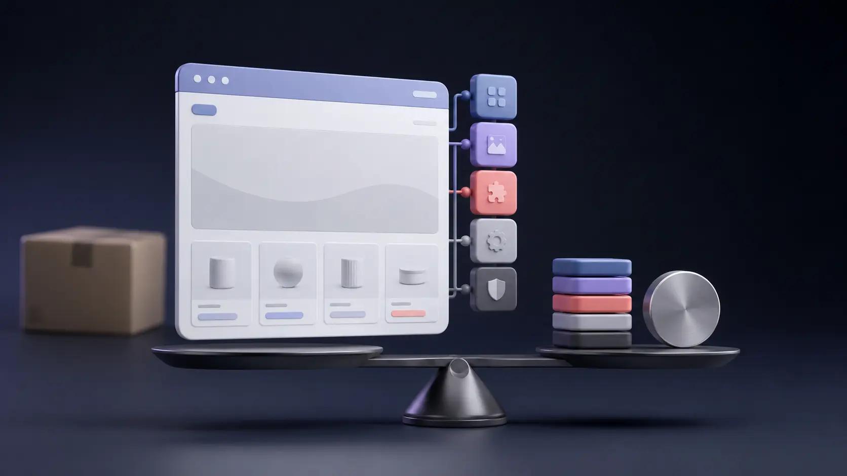
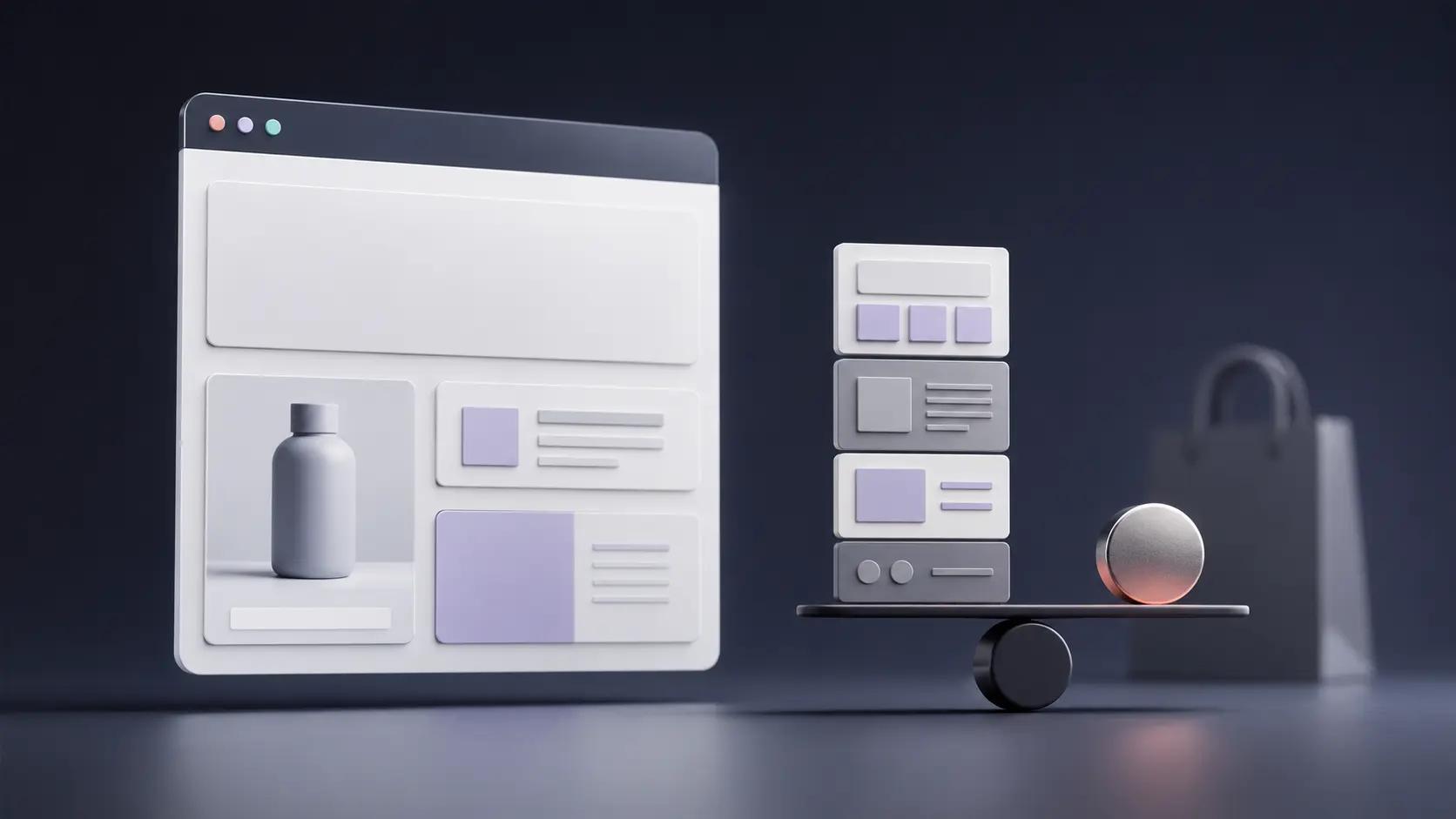
Real Example: What a High-Converting Landing Page Looks Like
Here's how the framework plays out in practice. PagePilot generates product pages that follow this exact structure—built from a product URL in minutes, ready to test immediately.
A strong PagePilot-generated page typically breaks down like this:
The key difference between a page like this and a standard Shopify product page: everything is in service of one action. No navigation. No related products sidebar pulling attention away. No distractions before the decision is made.
See what PagePilot can generate for your products →
Landing Page Template You Can Use Today
Here's a simple, reusable framework. Customize it to your product and traffic source:
[Headline]: Get [specific outcome] without [common frustration]
[Subheadline]: [Who it's for] + [key proof point or differentiator]
[Hero image]: Product in use, lifestyle context, or result photo
[CTA button]: [Action verb] + [what they get]
[Problem section]: 2–3 sentences naming the pain this product solves
[Solution]: 1 paragraph positioning your product as the answer
[Benefits]: 3–5 points focused on outcomes, not features
[Social proof]: 2–3 specific testimonials + star rating
[Offer + guarantee]: Price, free shipping, return policy, or guarantee
[Final CTA]: Same copy as hero CTA
Every section has a job. Every word should be earning its place.
Common Landing Page Mistakes to Avoid
The most common landing page mistakes are unclear messaging, weak headlines, and too many distractions—all of which reduce conversions and are all fixable with the right structure.
The mismatched messaging issue is worth calling out specifically: if your ad says "50% off sitewide" and the landing page doesn't mention the promotion, visitors feel misled—even if it's unintentional. Your ad copy and landing page copy need to be tightly aligned.
For a broader look at mistakes that hurt ecommerce growth, this post on dropshipping mistakes covers related pitfalls worth avoiding.
FAQs
What makes a landing page convert well?
Clear message match between the traffic source and the page, a strong above-the-fold headline, specific social proof, and a single prominent CTA. Speed and mobile optimization are table stakes, not bonuses. When all of those align, you're no longer hoping the visitor converts—you're guiding them to it.
How do I improve landing page conversion rates?
Start with your headline and hero section—they have the highest leverage. Then add specific social proof near your CTA, improve page speed, and begin systematic A/B testing on one element at a time. Resist the temptation to redesign everything at once; small, isolated changes tell you what's actually working.
What elements should a landing page include?
At minimum: a benefit-driven headline, a product visual, one clear CTA, at least two pieces of social proof, a trust signal (guarantee or return policy), and a mobile-responsive layout. Beyond that, every element you add should have a clear job—if you can't answer why something is on the page, it probably shouldn't be.
How important is page speed for conversions?
Very. A 1-second delay in mobile load time can reduce conversions by up to 20%. Prioritize image compression, script reduction, and caching before you spend more on ads. The fastest ROI in CRO is often just making the page load faster.
What are the best CTA practices? P
lace the CTA above the fold and again at the bottom. Use action-specific copy ("Start My Free Trial" beats "Submit"). Make the button high contrast and stick to one primary CTA per page. If you're unsure what copy to use, test two versions—even minor wording differences regularly produce double-digit conversion swings.
How do I write high-converting copy?
Lead with benefits over features, use specific numbers and outcomes rather than vague claims, and follow a framework like AIDA or PAS to structure the persuasion arc. Read your copy out loud when you're done—if it sounds like a brochure rather than a conversation, it needs another pass.
Stop Leaving Conversions on the Table
High-converting landing pages are not about design alone—they're about structure, clarity, and psychology. The best practices for high-converting landing pages come down to a handful of things done consistently well: a clear offer, a strong hero, specific proof, a single CTA, and a page fast enough to load before the visitor gives up.
Most merchants already have decent traffic. The gap is almost always the page itself—not the ads, not the product, not the price. Fix the page, and the traffic you're already paying for starts working harder.
Key takeaways:
- Follow a proven structure—hero, benefits, proof, offer, CTA
- Focus on conversion, not aesthetics—a beautiful page that doesn't convert is just expensive decoration
- Test and iterate continuously—your first version is a starting point, not a final answer
The fastest way to put these principles into practice—without building everything from scratch—is using a tool designed for exactly this.
Create your high-converting landing page with PagePilot →
Already have a Shopify store? Start generating product pages in minutes.